Why map the most and the least?
By mapping the patterns of features with similar values, it’s easier to see where the most and the least are and why does that happen.
Examples:
1. In Southern California, number of calls for service for a 3-month period were mapped to see how different parts of the service area compared. Light red indicated fewer calls and dark red indicated many calls.

2. The Qatar Ministry of Pubic Health mapped public health statistics to compare the quality of health across the country. They can map the number of visits/person in health care centers, percentage of visits in which prescriptions were given, etc. Centers in south prescribe drugs more often indicated by the dark orange versus the light yellow centers.

What do you need to map?
Quantities associated with discrete features, continuous phenomena, or data summarized by an area can be mapped.
1. Discrete Features
Individual locations and linear features are represented with graduated symbols, whereas areas are shaded to represent quantities.

2. Continuous Phenomena
Defined areas are displayed using graduated colors and surfaces are shown using graduated colors or a 3-D perspective view.

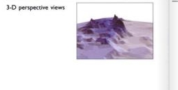
3. Data Summarized by Area
It is displayed by shading each area based on it value or using charts to show the amount of each category in each area.
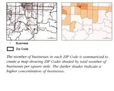
Understanding quantities
To map the most and the least, symbols are assigned to features on an attribute that contains a quantity. This can be counts, amounts, ratios, ranks.
1. Counts and Amounts
Count is the actual number of features on the map.
Amount is the total of a value associated with each feature.
Counts and amounts show total numbers.

2. Ratios
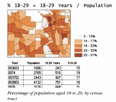
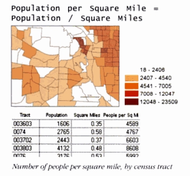
They show the relationship between two quantities, and are created by dividing one quantity by another for each feature.
The most common ratios are averages, proportions, densities.

3. Ranks
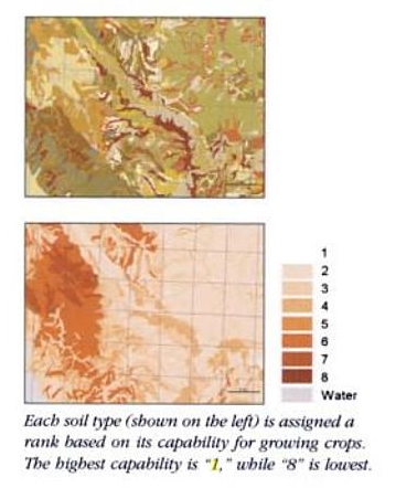
Ranks put features in order, from high to low. They show relative values rather than measured values.
Examples:
Ranks can be used to state the scenic value of a stream.

Soils can be ranked according to its capability for growing crops.
[…] Week 5, 02/11/2009: Mitchell Chapter 1 — Introducing GIS Analysis Week 5, 02/09/2009: Mitchell…Week 5, 02/11/2009: Mitchell Chapter 5 — Finding What’s Inside Week 5, 02/11/2009:: Mitchel Chapter 6 — Finding What’s Nearby Week 5, 02/11/2009: Mitchell Chapter 7 — Mapping Change […]